
Showcase, tabs
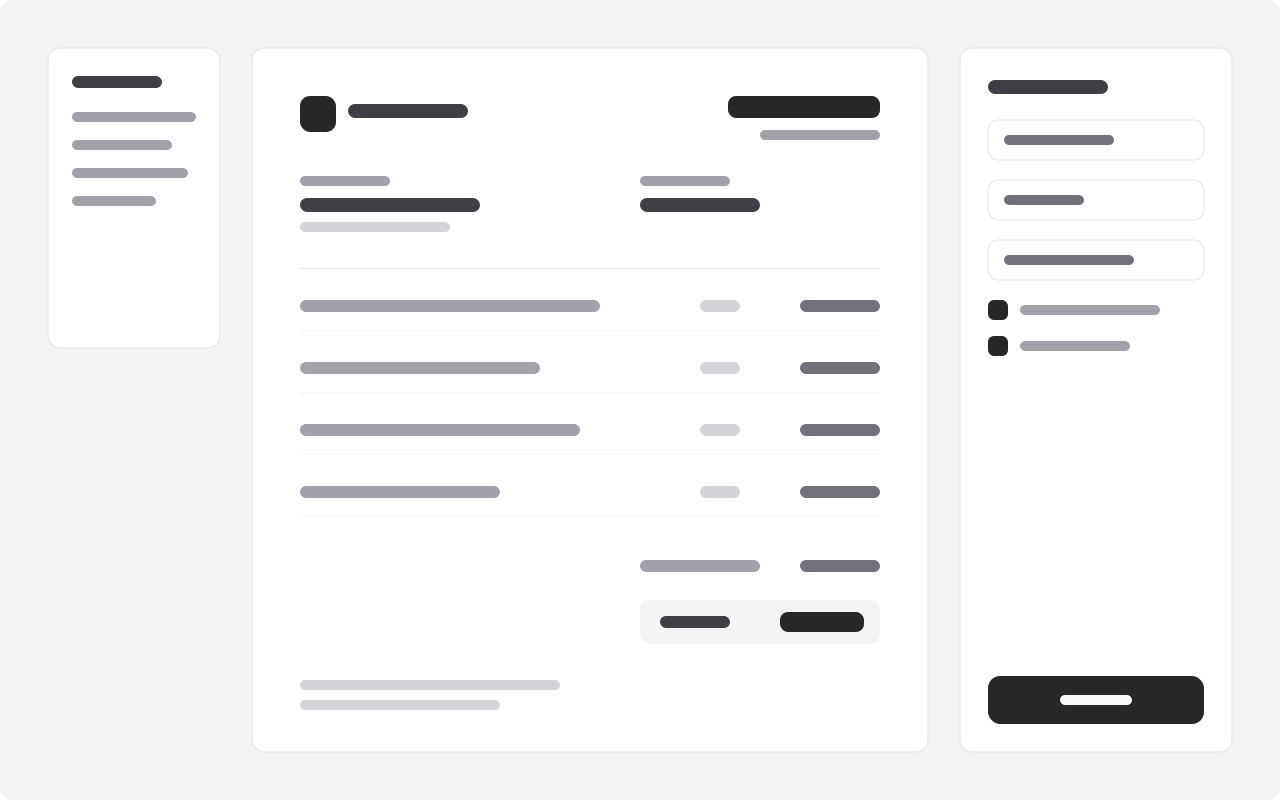
betaThe product one part at a time: tabs above a panel with the part's promise, ticked facts and a link beside its screenshot.
The product
One app for the money side of your work
Three screens you will open every week, and nothing you will not.
Invoices that write themselves
Start from a quote or a timesheet; your rates, taxes and terms fill in. Send it as a link the client can pay from.
- Quotes become invoices in one click
- Taxes by country, credit notes included
- Your logo and colours
Paid the way your clients pay
Cards, bank transfers and mobile money from one link. Each payment is matched to its invoice, without you.
- Mobile money in twelve countries
- Payouts to your bank in two days
- Partial payments and deposits

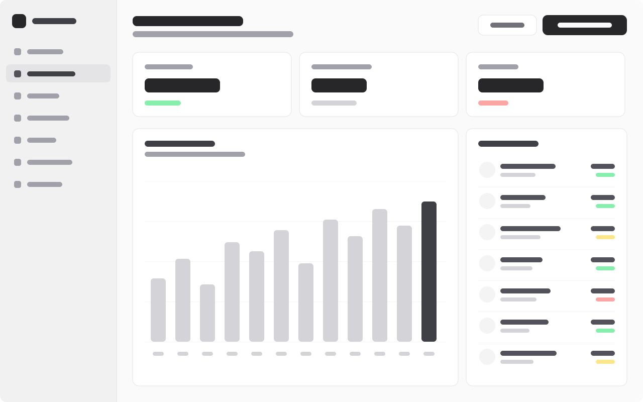
Know what comes in next month
Money owed, late and on its way, by client and by project, with exports your accountant will thank you for.
- Cash flow forecast
- Late payers at a glance
- Quarterly exports
- Use it
- A product with two to five distinct parts, each with a screen worth showing.
- Avoid it
- One screen to show: hero-centered's product shot is enough.
- Pairs with
- Features, gridTestimonials, carousel
Installation
It installs into components/blocks/showcase-tabs/, with what it uses (Button, Tabs) and lib/blocks.ts.
Usage
Without content, the block shows its example. Pass your own, typed by the block's schema, from a content file (here, the example with one field changed):
Two to five tabs, each a part of the product: its promise, up to four ticked facts, an optional link and its screenshot. Every panel stays in the page's HTML, so search engines and find-in-page reach all of them.
Content
| Field | Type | Limits | Guidance |
|---|---|---|---|
eyebrowoptional | string | ≤ 24 chars | One or two words above the title: 'The product'. |
title | string | 8–70 chars | |
sublineoptional | string | ≤ 180 chars | |
tabs | object[] | 2–5 items | |
tabs[].label | string | 2–20 chars | The tab: one or two words, 'Invoices', 'Payments'. |
tabs[].title | string | 4–60 chars | What this part does for the reader. |
tabs[].description | string | 20–220 chars | |
tabs[].pointsoptional | string[] | ≤ 4 items | Up to four short facts, ticked. |
tabs[].ctaoptional | object | ||
tabs[].cta.label | string | 1–32 chars | A verb first, two to four words: 'Start free', 'Book a table'. |
tabs[].cta.href | string | A path ('/pricing'), an anchor ('#menu'), or a full URL. | |
tabs[].image | object | The part of the product, landscape (16:10). | |
tabs[].image.src | string | A local path ('/images/terrace.jpg') or the project's asset URL. | |
tabs[].image.alt | string | ≤ 140 chars | What the image shows, for people who cannot see it. Empty only if purely decorative. |
tabs[].image.width | integer | ||
tabs[].image.height | integer |
Props
| Prop | Notes |
|---|---|
content | ShowcaseTabsContent; the example when left out |
id | the section's id, for anchor links; "showcase" by default |
headingLevel | 1, 2 or 3: the heading's tag; 2 by default |
className | on the <section>, for spacing |
Accessibility
- The tabs follow the WAI-ARIA tabs pattern (arrow keys, Home, End), from Base UI.
- Each panel's title is a heading one level below the block's.