
Features, alternating
betaTwo to five features told one at a time, as rows of text and image that swap sides, each with ticked facts and a link.
Features
Everything between the quote and the payment
Three things Senbon does so you can stop doing them.
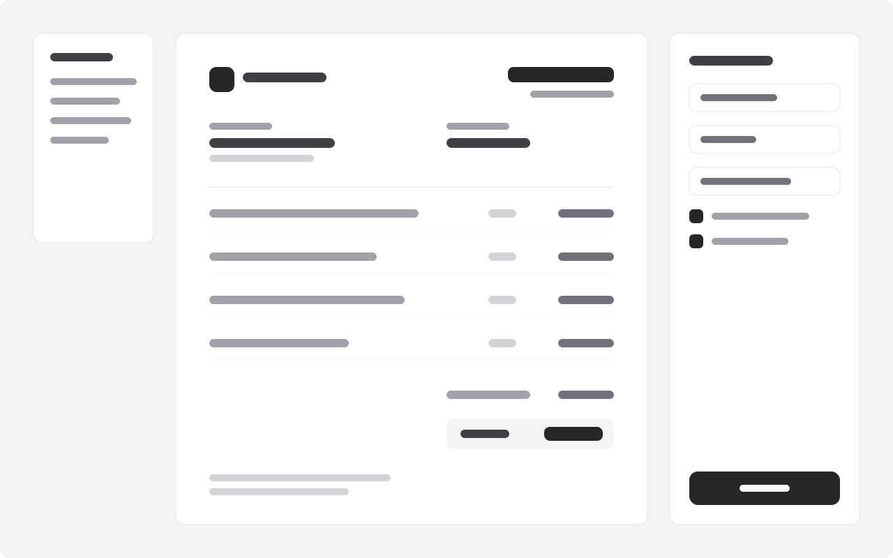
Invoices
Invoices that write themselves
Start from a quote or a timesheet. Your rates, taxes and terms are already there, and the client gets a link they can pay from.
- Quotes become invoices in one click
- Taxes by country, credit notes included
Payments
Paid the way your clients pay
Cards, bank transfers and mobile money from one link, each payment matched to its invoice without you lifting a finger.
- Mobile money in twelve countries
- Payouts to your bank in two days

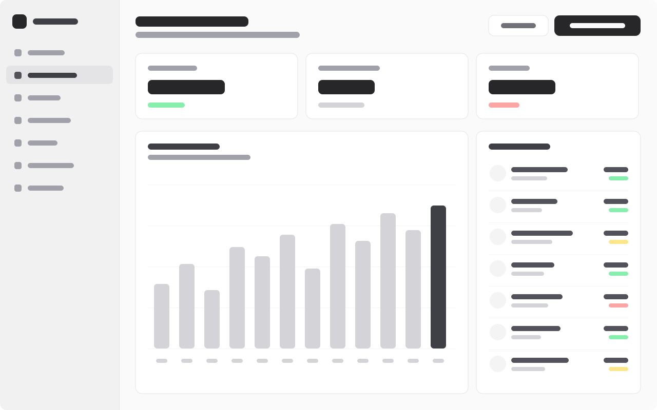
Reports
Know what comes in next month
Money owed, late and on its way, by client and by project, with exports your accountant will actually like.
- Cash flow forecast
- Quarterly exports
- Use it
- A few features that each deserve a screenshot and a paragraph.
- Avoid it
- Many small features: features-grid or bento-features.
- Built with
- Button
- Pairs with
- Hero, splitTestimonials, wall
Installation
It installs into components/blocks/features-alternating/, with what it uses (Button) and lib/blocks.ts.
Usage
Without content, the block shows its example. Pass your own, typed by the block's schema, from a content file (here, the example with one field changed):
Rows alternate on a wide screen (text then image, image then text) and stack, text first, on a narrow one. Two to four rows read best; each can have up to three ticked facts and a link.
Content
| Field | Type | Limits | Guidance |
|---|---|---|---|
eyebrowoptional | string | ≤ 24 chars | |
title | string | 8–70 chars | |
sublineoptional | string | ≤ 180 chars | |
rows | object[] | 2–5 items | Rows alternate: image right, then left. Two to four read best. |
rows[].labeloptional | string | ≤ 24 chars | A word above the row's title: 'Invoices'. |
rows[].title | string | 4–60 chars | The benefit: 'Invoices that write themselves'. |
rows[].description | string | 20–220 chars | |
rows[].pointsoptional | string[] | ≤ 3 items | Up to three short facts, ticked. |
rows[].ctaoptional | object | ||
rows[].cta.label | string | 1–32 chars | A verb first, two to four words: 'Start free', 'Book a table'. |
rows[].cta.href | string | A path ('/pricing'), an anchor ('#menu'), or a full URL. | |
rows[].image | object | What the row describes, landscape (16:10). | |
rows[].image.src | string | A local path ('/images/terrace.jpg') or the project's asset URL. | |
rows[].image.alt | string | ≤ 140 chars | What the image shows, for people who cannot see it. Empty only if purely decorative. |
rows[].image.width | integer | ||
rows[].image.height | integer |
Props
| Prop | Notes |
|---|---|
content | FeaturesAlternatingContent; the example when left out |
id | the section's id, for anchor links; "features" by default |
headingLevel | 1, 2 or 3: the heading's tag; 2 by default |
className | on the <section>, for spacing |
Accessibility
- Each row's title is a heading one level below the block's.
- Images have their own
alt.